Showing posts with label Collector Spotlight. Show all posts

Thursday, February 2, 2012

Collector Spotlight #16 Alpha and Omega

Unfortunately, during my first year and a half of tattooing I wasn't much focused on keeping good records, and so there are some piece (such as this one) that I really am proud of, yet I cannot remember who is wearing it. I feel terrible about that, but then there it is. Now, as I have come into my own I do maintain much better records of my work, who wears it and the pictures of the process. and still working to improve that part of my job all the time.
If any of my readers knows the bearer of this tattoo, let me know. I would like to add that to this image.

So anyway, this was a piece that quite a challenge, the parallel lines inside the letters as well as the fillagree around them, I was lucky it was so big, so I could work through all the detail with room to breath. It seems that the bigger the design gets, the easier it is to get the detail, but of course the longer it takes. smaller pieces with high detail tend to seem harder in my opinion.

Stages one and two are shown side by side here, I didn't have any other pics of this piece to show, and I am so short on time, I figured this would be a fun and easy bit to post today.

thanks for reading! I'll see you here next week!

Friday, October 7, 2011

Collector Spotlight #14 AK's Bouquet Backpiece

"This time around we have Arlene's (AK) Flower Bouquet Back Piece. And this tattoo has been a lot of fun, a lot endless fun ha!(serious). We've been working on it for a while now, as it is still growing. This part however, the initial concept still is a great process for me to show. I have all the pics I need (two spotlights in a row!) to tell at least this part of the story.

Also you may notice a few changes to the overall layout on this spotlight. I have added the Jade Monkey Logo, my Chaos Logo, a watermark and a bit of contact info. I figure these pics are getting some global screen time now, I might as well make sure all the right info is on each image and some security behind the images. I'm not worried about images thieves or tattooists swiping my ideas, as they say imitation is the highest form a flattery. I do, however, want to back up that this all original work though. I will keep this kind of info on all the Spotlights I do from now on, and may add more.

But lets get to the point here shall we?
AK is a friend of my Aunt's and came to me with this Idea of a flower bouquet on her back that has some personal meaning, but wanted something with a lot of different flowers. Since she wanted things to be generally symmetrical, I kept that in mind with the composition but also didn't want it mirrored. so we mixed up the individual elements.
In the concept pic you can see that the right side is a bit bare, AK already had a couple of tattoos on her back. You'll see those in the image below. One, the unicorn, she wanted covered, and the Frog she wanted to keep. So I didn't have design the right side (her left) but I did have to figure out how to cover this old unicorn with a bright yellow and orange flower. Not the easiest way to go about a cover up but why go easy?
So here we have a few shots showing her before with the Frog and the Unicorn. No close ups, not much to see, yet. But here I also show the stencil applied, and the outline complete. A solid start to a complex piece. The trick is to look at it as a collection of smaller, more simple pieces, that way it doesn't get overwhelming and it's much easier to handle. I think I learned this concept in JROTC or math class or something... I'm not sure, some abstract idea I caught on to that has helped me in ways I cannot even list. I manage all of my work this way actually.
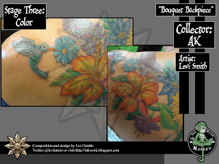
So here we have some shots of our color progress, as you can see I am not a photographer, but I manage. We worked the flowers a couple at a time. a couple hours at time. I  know a lot of other artists work in larger time blocks, but I've noticed that people tend to heal easier and faster with a moderate amount of work versus extreme. It's also more affordable for most people as well,and I dont get caught up feeling like the work I am doing is dragging on or boring. So in my case, working in sessions that last about 2-3 hours tends to work out better for me.
More shots of our color progress showing how the design has been integrated with the existing frog on the right. The focus was to bring the frog into the rest of the design and make it all seem as one.
The Left side, with the unicorn cover up shown here with the added hummingbird. We plan to add more "creatures" to the piece overall once everything planned for the back is done. Some bees and dragonflies. Maybe a few ladybugs and other fun garden wildlife. The cover up was a bit tricky as the colors for the flower are not the best colors to use for this kind of task. Yellow and orange typically don't cover dark colors well. But we lucked out being that the unicorn was a bit faded, and I was able to work the flower shading into the darker spots of the cover up without making it look too forced or awkward  Also using the complimentary colors  (blues, purples and greens) in the flowers around it help make those yellows and oranges seem brighter, manipulating our perceived contrast.
So with everything finished here. we can see the entire composition and how it it fits on the body. I really like how this piece turned out and I am confident that AK did as well. not long after completing her upper back bouquet piece, did she start talking about adding more. Ha! I love it when that happens. there is no better compliment to my work, than someone wanting more of it. And of course good art is never done, just as life is never complete.
So as a sample of what we are working on next. Adding to the flower arrangement with another set of flowers to bring this piece to a full back piece. We're including flower types that are not in the upper portion. As you can see we're already well under way and AK has even more Ideas once we are done with this segment, I will likely show the new progress in a "part2" to AK's Spotlight in the future. 

AK's piece wasn't the hardest, craziest, or most difficult tattoo I have done. But it is a piece I am quite proud of and am excited to keep working on. The challenges I enjoy about a piece like this is in arranging the flowers so they don't look like a mess, and each individual flower can be appreciated on it's own.

Oh, and I think it looks bad ass, but I am biased.

Sunday, September 25, 2011

Collector Spotlight #12 Starla Doss' FlowerSkull

We started this piece at the Original Jade Monkey, but I think we started talking about before I left Artistic Tattoo. The concept for this piece was pretty straightforward as tattoos go, and the prep wasn't very difficult at all. The execution of this piece, however, with all of it's detail, ended up being quite a bit more difficult than I initially thought. 
Starla had wanted this design for a while. Saving the image from a magazine until she was ready to get it. When she first showed it to me I remember thinking how bad ass it would be, and that it wouldn't be too hard to pull off. The prep was simple and straight forward,and gave no warning of the deceptive complexity hiding within. I took the color image and converted it to greyscale before printing it out and lightboarding it to make our stencil pattern.
This when I started to realize how difficult this tattoo was going to be. Just working out all the shapes and patterns took quite a bit of time on paper.
The actual tattoo outline itself was less complicated, having already made myself familiar with the design at this point. This was probably the easiest part of the whole tattoo, even though it was clear to me at this point what I had gotten myself into.
Some of these stages, such as the black fill, took longer than I thought they would. not that there was a lot of ground to cover at this point, but that it was so specific and varied. Keeping track of what was next and where not to fill can slow this part of a tattoo down to a crawl. But a bit more time spent here to get it right will always pay off, especially when the end result is clean and correct. The other alternative is risking making simple mistakes and condemning your client to a life of having a bad tattoo, and thus a less positive self image. Something I'd rather not deal with.
Again, as usual, I didn't take enough pics, or lost them. But let me be clear, this piece was not colored all in one session. That's hard to show here as this stage isn't as spread out as I would like. The color process took a few sessions to work out, concentrating on different areas in different sessions, and a session of just highlights and touch ups. The end result however is what it's all about and this piece just kicks ass all day long. I have always been more than happy with how it turned out. The strong blacks really reinforce the color and hold the piece together, and though the detail is very intricate, I feel that it will hold up a long time on account of the concentration of ink. There's just nowhere for those lines to spread out to as the piece ages.
And perhaps it's just me, but the color concept we went with is a lot more interesting for the design, and allows the individual elements to stand out as well remain part of the whole.

I can't take any credit for the design, I didn't draw this thing, and I doubt an original version of this concept by my hand would have turned out as visually strong (maybe after a few versions...) but even so, this is a piece I have always been proud of. Even if it isn't 100% custom.

Wednesday, September 21, 2011

Collector Spotlight #11 Tony Digg's Schooner

This is a piece I had done a few years back, that was a breakthrough kind of piece. After looking at the work of Anil Gupta and trying to figure out how the hell he pulled off the work he's done. I had to start thinking outside the typical approach for a tattoo of - outline, shade and color - and really started to look at the process as something more similar to painting.
We start off with the picture Tony liked, and his primary question was if I could make it look like the picture, and not like a "drawing". There there was the challenge, and I was excited to give it a shot. I had done only a couple of pieces in this manner, but they had been much smaller, and not nearly as complex. I showed Tony those examples and went to work.
I built the stencil more as a paint by number kind of pattern. This is to show, not where the lines go, but the values. Separating highlights, shadows and midtones. This method is used quite a bit now, especially with color portraits.
From there, if you look more closely, I did a pencil grey outline of the pattern as I knew I would not be able to finish the entire design in one sitting, and this grey line would serve as a permanent stencil for later. Something I do now primarily for larger pieces that don't have line work, or the lines will be minimized, I will also do line work in color, if the piece uses no black. From there I started shading in the clouds as I felt needed, to define the initial spacial relationships in the piece.
As we progressed through the piece, I built up the colors and tones carefully, over multiple sessions, as I would a painting. I did  this to work each element of shadow midtones or highlight up to the level I felt was correct for the piece. Making sure I didn't do too much.
As with most of these collector spotlights. I really wish I had taken more photos of the process. But especially with these earlier pieces, I had no idea I would have a use for all these photos. I was really happy with how this piece turned out, perhaps not 100% accurate, but damn close! I really don't get to do enough pieces like this, painting reproductions. I would really love to do more.

There is a chance in the future, Tony will have me do a second Schooner on his other shoulder blade, and connect the two. The painting at top is of a pair of racing schooners, each piece showing the other  boat in the distance. Separate perspective shots of the same scene.

Monday, September 19, 2011

Collector Spotlight #10 Robert Wright's THOR

Damn it's been a while since I've done one of these. Probably should try to do them more often. The Collector Spotlights are the primary content for my blog after all. Actually, I have been going through ALL of my photos, and sorting things out to put together a new physical portfolio, something I haven't done in two years. and the mountain of pics I have to go through is ridiculous! But it must be done. 
As a result though, I was able to dig up a few great candidates for some new CS posts, and hope to get them all posted up soon.

Ok, on to the piece. This has been one of my favorite comic book pieces I've done (close second to the first Goon piece, only cause I like the Goon comic more than Thor Comics, sorry Rob,but it's true)
However, this is still one of my most favorite tattoos I have done, simply because I am a comic book geek. 
Rob however is a huge Thor Fan, and wanted to get this piece as soon as the word "Thor" was whispered in the lots of Hollywood. Keep in mind, this tattoo is more than two years old at time of posting, and Thor was still in casting. I remember talking to Rob when they were putting the cast together, he was worried that Chris Hemsworth would be too small. Ha! I thought it was cool though, how they made Anthony Hopkins's Odin bigger than Thor in the movie. Which was bad ass I might add. I was pretty skeptical at first, with the mythology aspect and especially the Rainbow Bridge.

On to the Spotlight!
The initial sketch here was inspired by a piece that Michael Turner (RIP) did a while back, that just rocked it. So in respect to Turner, I re-imagined the piece. We changed the uniform up (I'm not a fan of the classic Thor costume) and I was quite happy with myself that our revamp was so close to the movie version, even down to the choice in scale mail style (though my coloring is more comic book, than the movie)
Fresh outline and Shading. Rob swelled quite a bit here. but unknown to us at the time, Rob was dealing with a medical condition that was affecting how his body was able to handle the procedure. The whole thing was about 20x more painful for him, and his skin reacted in pretty dramatic ways (swelling, bleeding, redness so intense it was hard to gauge the color saturation I was getting). Through all of this Rob sat like a stone, even though he threatened to hurt me back many times.
Nice little close up of the greyshade version.
The Coloring took more than a few sessions, though I cant find all the staged out coloring photos (surprised?) But as you can see, i went with a much more comic book color palette here, the movie wasn't even out when we did this, or it may have influenced our color choices, but Rob here is a true fan, and wanted this piece done before the movie was released.
A Few close ups of the color details of the finished piece.
We did end up finishing the rocks, but I never got a picture of that... must have forgot... forgive me, I am an artist.
 a 
Rob has since moved to Utah, where apparently there is better work and bigger tires for him to toss around. Rob is a body builder who is into the Strong Man Competitions. Not the "cosmopolitan, oiled up" weightlifter type, he's more the "shot-put a Buick kind of guy".
One of my oldest and Best friends, this guy has saved my ass so many times without batting an eye or hesitating a second. I will never be able to repay him, even if I lived a thousand years. If you got this guy in your corner, than you got nothing to worry about. And on a side note, he was also the very first person to commission a piece of art from me and pay for it. I'll get that drawing to you one of these days bro!